1. Translating Genomic Signal Detection to Market Volatility
In genomics, we look for signal buried in noise — moments where the presence of a transcription factor subtly alters the local landscape of DNA. Tools like MACS are designed to identify these moments by detecting statistically significant enrichments, or "peaks," across genomic data. These peaks represent events: a molecular decision, a regulatory switch, a biological consequence.
Financial data is no different in principle. It is noisy, complex, and high-dimensional — but underneath it all, we know that real events leave traces. In the market, these aren’t protein bindings. They’re volatility shifts: moments of investor panic, exuberance, structural shifts, or signal leakage. These are the market’s regulatory events. And volatility — how much a price moves intraday — becomes our signal of interest.
Why volatility?
Volatility reflects not just noise, but uncertainty and information processing. Sudden increases in volatility often precede or follow key market events — earnings surprises, macro announcements, institutional rebalancing. By detecting localized surges in volatility that deviate from historical norms, we capture a market’s attempt to interpret and react. This makes volatility an ideal analog to transcriptional regulation in biology: a measurable response to unseen stimulus.
Daily open and close prices were retrieved for both the stock and the S&P 500 benchmark, calculating absolute return as a proxy for intraday volatility. This allows us to measure the magnitude of price movement independent of direction — a natural analog to signal intensity in genomic readouts.
Next, the expected behavior was modeled using a 60-day rolling linear regression to predict stock volatility from benchmark volatility. The resulting residuals — the differences between actual and predicted values — highlight moments where the stock behaves in a way not explained by market trends, revealing company-specific volatility signals.
With these residuals in hand, sliding statistical scan was executed. Using a 5-day window, residuals were summed within the window and compared that sum to the expected value, calculated as the background mean multiplied by the window size. Then, z-score was computed like such:
z = (observed window sum – expected sum) / (standard deviation × √window size)
This formulation allows us to quantify how extreme a volatility cluster is compared to the rolling historical context. A one-tailed p-value was computed from the z-score using the normal distribution — testing how unlikely it was to see that degree of deviation by chance.
To control for false positives, the Benjamini–Hochberg FDR correction was applied across all candidate windows. Significant windows were then merged if they overlapped or were close in time, resulting in broader volatility regions. These merged peaks were carefully refined: each was assigned a summit — the day with the maximum residual within the region.
From Biology to Markets
Just as MACS detects functional genomic regions amid biological noise, this strategy detects regimes of financial stress or transition. Each volatility peak becomes a hypothesis: something has changed in how the market values risk. This interdisciplinary approach illustrates how domain-specific tools — built for one purpose — can uncover hidden dynamics in an entirely different system.
This methodology isn’t just about technical translation — it’s about reframing how we think about signal. In genomics, the genome is stable but dynamic in interpretation. In finance, prices are dynamic, but we search for moments of relative stability in behavior. By leveraging the statistical rigor of genomics, MarketMotifAI offers finance a new lens: one grounded in signal, background, and structure. And in doing so, bringing novel form of analytical precision to the world of risk.
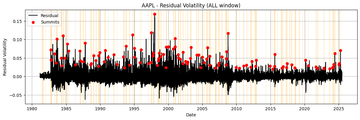
Visualizing Residual Volatility in AAPL
Below is the residual volatility profile for AAPL using the described MACS-inspired method. You can explore how the signal varies across different time windows. Each line represents how much the stock's volatility diverged from the predicted baseline, yellow shaded peak regions highlight statistically significant deviations, and red dots represent the summit (highest point of volatility within the peak region).
2. Capturing Context Around Peaks
Detecting peaks is only the beginning. To understand *why* a volatility surge happened — and potentially *predict* future ones — we must analyze the broader context surrounding each event. Just like in biology where the genomic context around a transcription factor binding site provides regulatory clues, here we examine technical indicators, sentiment data, and macroeconomic events around each market “summit.”
A rich set of features for each trading day was engineered, including:
- Technical Indicators: RSI, MACD, Bollinger Band Width, rolling volume statistics
- Volatility Context: Short- and long-term means and standard deviations of residuals
- Market Stress Proxies: SP500 volatility, VIX
- News Sentiment: 3-day and 7-day rolling means and standard deviations
- Event Flags: Binary flags for CPI releases and FOMC announcements
21-day window (±10 trading days) to capture the market’s evolving state. This resulted in a 3D matrix: peaks × days × features.
To contrast real volatility events with background market behavior, matched control windows were selected — non-peak days far from any volatility cluster — and performed the same context extraction. This allows downstream models to learn what distinguishes a volatility regime from a typical market pattern.
Context Sequences as Time-Embedded Features
Each volatility peak becomes a sequence: a structured time-series of behavioral indicators. These sequences, labeled as either “Peak” or “Control,” form the input for downstream classification models. This mirrors how deep learning in genomics learns from DNA windows surrounding motifs to infer binding potential — but here, our “sequence” is a dynamic signal of market behavior.
This context-aware approach captures the interplay between multiple market forces — enabling MarketMotif AI to understand not just when volatility happens, but *why*. In doing so, each peak is turned into a hypothesis: an interpretable financial micro-event, embedded in its technical, emotional, and macroeconomic surroundings.
3. Discovering Behavioral Motifs in Financial Signals
Just like biological motifs reflect conserved patterns of gene regulation, market behavior around volatility peaks often follows recurring structures. These structures — or behavioral motifs — can be discovered by clustering time-embedded feature windows around significant volatility events.
Each 21-day sequence of residual, technical, and sentiment signals are first flattened into a single vector. Using Principal Component Analysis (PCA), the dimensionality of this data is reduced while retaining its structure. Then, k-means clustering is prefrmed to group similar peak sequences together.
For each cluster, we calculate its enrichment compared to matched control sequences using Fisher’s Exact Test, adjusting for multiple comparisons via FDR correction. The clusters significantly enriched in true peaks are interpreted as meaningful motifs — reproducible market patterns surrounding volatility.
Extracting Interpretable Motifs
Each significant cluster has a centroid — the average pattern of the time-series in that group. These centroids are reshaped back into 21×N matrices (where N is the number of selected features), forming interpretable motifs that describe how each signal evolves before and after volatility peaks.
To extend the utility of these motifs, the entire dataset is scanned — every trading day — and compute the similarity between the surrounding 21-day window and each discovered motif. This is done via Pearson correlation, creating new features that quantify how closely current behavior matches known high-volatility patterns.
These motif similarity scores are added as new predictors to the model. They act as early warning indicators: if a motif that typically precedes a volatility spike starts to reappear in the market, the system can flag potential risk buildup.
Behavioral Genomics for Markets
In genomics, motifs reflect regulatory logic. In finance, our motifs reflect dynamic behavioral logic — technical signals aligning with sentiment and macro shifts to produce instability. By using a rigorous, unsupervised pipeline grounded in statistics and time-series decomposition, I let the data reveal its hidden playbook.
This approach transforms raw volatility detection into a motif-aware system — one that learns from past stress signals and maps them forward. It’s an adaptive framework for risk detection, grounded in the idea that structure reveals intent, and that volatility doesn’t just occur — it forms patterns.
4. Predicting Fragility Using Machine Learning
Once behavioral motifs are quantified, the final step is building a predictive model that can anticipate future fragility — windows when a volatility spike is likely to emerge. To do this, we frame a supervised classification task: given today’s features, can I predict whether a volatility peak will occur within the next 5 trading days?
Each date was labeled with a binary outcome: 1 if a volatility summit occurs within the next 5 days, 0 otherwise. This target variable forms the basis for training a machine learning model.
XGBoost, a high-performance gradient boosting algorithm, was employed and its hyperparameters were optimized using Optuna, a powerful Bayesian optimization library. The optimization objective was to maximize the ROC AUC score — a robust metric for evaluating performance in imbalanced datasets.
Why Time-Based Splitting?
Instead of a random split, a time-aware train/test split was used — training on the earlier 80% of the timeline and testing on the most recent 20%. This simulates real-world deployment, where the model must predict the future using only past data.
After training, the optimal probability threshold was computed using Youden’s J statistic from the ROC curve — balancing sensitivity and specificity. The final model was evaluated using:
- Confusion matrix (TP, FP, TN, FN)
- Precision, recall, F1-score
- ROC AUC score
In our case, recall — the ability to catch true fragility events — is prioritized over precision. This decision reflects a risk-sensitive stance: missing a fragile window (false negative) is often more costly than falsely raising an alert (false positive). The model is tuned to avoid overlooking early signs of instability, even if it means occasionally flagging stable periods as potentially fragile.
The resulting classifier isn’t just a volatility detector — it’s a fragility predictor. It learns patterns of instability before they manifest, using a blend of engineered indicators, event flags, and motif similarity scores.
From Signal to Forecast
This final step completes the arc: from biological signal detection to market fragility forecasting. We move from identifying statistical peaks to extracting interpretable motifs, and finally to training a machine learning model that transforms today’s context into tomorrow’s risk prediction.
MarketMotif AI brings together the precision of genomics and the urgency of finance — building models that don’t just explain volatility but anticipate it.
ROC Curve
The ROC curve plots the tradeoff between true positive rate (sensitivity) and false positive rate. The closer the curve hugs the top-left, the better the model is at distinguishing fragility from stability. The shaded area represents the ROC AUC — a summary score of overall performance.
Interpreting the Model with SHAP
To understand why the model makes a particular fragility prediction, powerful tool from interpretable AI called SHAP (SHapley Additive exPlanations) is used. SHAP assigns each feature a contribution value, showing how much that feature pushes the prediction higher or lower for a specific instance.
In the plot below, the average absolute SHAP value is shown across all test dates. Features with higher SHAP values are more influential in driving model decisions. These may include traditional signals like RSI or MACD, macro flags like CPI/Fed, or learned motif similarity scores that track how closely a current window resembles past fragility patterns.
This allows us to move beyond a black-box classifier — transforming the model into a transparent system that explains its predictions in terms of familiar and interpretable market features.
SHAP Feature Importance Summary
Notably, the most influential features in the model are often the motif similarity scores. This reflects how strongly recurring patterns in the lead-up to past volatility events shape future risk — motifs encode temporal structure that static indicators alone cannot capture.
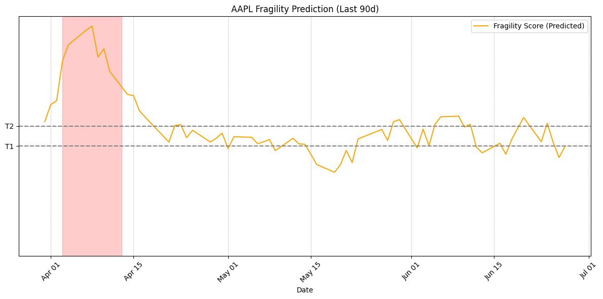
5. Defining Fragility as a Spectrum
Traditional binary classification reduces risk to a yes/no decision. But fragility isn’t binary — it’s a gradient. Some market windows show clear stability, others clear danger, and many lie in between. To model this reality, we extend our framework to include a third category: uncertain.
The model’s output probability is used and two thresholds are defined — T1 and T2 — to categorize each day:
- Predicted as Stable if probability < T1
- Predicted as Uncertain if T1 ≤ probability < T2
- Predicted as Fragile if probability ≥ T2
To find the best T1 and T2, a grid search is performed across hundreds of combinations and evaluate the resulting 2×3 confusion matrix. This normalized matrix is compared to a target distribution — a desired behavior pattern — and minimize the weighted mean squared error (MSE) across both classes.
This lets us tune the model not just for accuracy, but for interpretability and practical application: We control how conservative or aggressive the system should be when flagging fragility.
Why Optimize the Thresholds?
Most thresholds aim to maximize a metric like ROC AUC. But in real-world finance, we care more about how decisions are distributed. This method allows us to encode domain-specific preferences — such as preferring false positives over false negatives — directly into the thresholding logic.
The final result is a three-class fragility scoring system that adapts to risk sensitivity. It lets us distinguish clear calm from clear crisis — and gives us the ability to track transitions in between.
Confusion Matrix
| Pred No Peak | Pred Uncertain | Pred Fragile | |
|---|---|---|---|
| True No Peak | — | — | — |
| True Fragile | — | — | — |
This matrix breaks down how the model's predictions compare to actual outcomes. Rows represent true labels, while columns show predicted categories: stable, uncertain, and fragile. The goal is to minimize misclassification while preserving interpretability.
Tracking Fragility Across Time
This plot displays the predicted fragility state of the market for AAPL over time. The model assigns each day a probability of being fragile, andtwo optimized thresholds are applied to convert these into three categories: Stable, Uncertain, and Fragile. You can vizualize the last 90 days to explore how fragility evolves before, during, and after volatility events.
Showing fragility prediction over the past 90 days.